The GeoEAS program was developed for the EPA to allow simple analysis of spatially distributed data, primarily concentrations of contaminants in soil (E. Englund and A Sparks, GEOstatistical Environmental Assessment Software. Environmental Protection Agency EPA-EMSL, Las Vegas USA, 1991. ) The original program was written for DOS (the original operating system for PC's for you youngin's), but Andy Long supports a Unix Version on his web site. Dr Long also publishes an online documentation for the program. Geo-EAS (Geostatistical Environmental Assessment Software) is a collection of interactive software tools for performing two- dimensional geostatistical analyses of spatially distributed data. Programs are provided for data file management, data transformations, univariate statistics, variogram analysis, cross validation, kriging, cokriging, post plots, and line/scatter graphs. It is a bit crude by today's standards, but it is easy to learn, free, and it works!
Your lesson is adopted from the tutorial provided with the software and adopted by Andy Long for the Unix Version.
You will need to prepare a directory for the lesson. In your class directory create a directory called "geostat". From the like-named directory in the class directory, copy the file "example.dat" into that directory. You should have "/nsm/class/gly560/username/geostat/example.dat".
To start GeoEAS go to your geostat directory and type:
use geoeas
You should get a response like this:
Programs from which to choose:
prevar
vario
scatter
stat1
krig
xvalid
cokrig
cokval (or rn)
corres
trans
dataprep
3-d View (or geo-gobi)
After this, to run any program type:
geoeas program
where program is the program name.
The scenario for the example is that data has been acquired from analyses of 60 soil samples at a site contaminated with arsenic, cadmium, and lead. The example file you will used is called example.dat, and it contains the position of a number of samples on an X Y (Easting, Northing) coordinate system, and concentrations (in ppm). The first few lines are as follows:
Example.dat - Geostatistical Environmental Assessment Software
5
Easting feet
Northing feet
Arsenic ppm
Cadmium ppm
Lead ppm
288.0 311.0 .850 11.5 18.25
285.6 288.0 .630 8.50 30.25
273.6 269.0 1.02 7.00 20.00
280.8 249.0 1.02 10.7 19.25
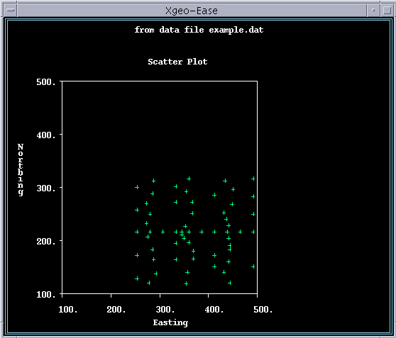
First we will examine the spatial distribution of the data points, using the program "scatter." Type:
geoeas scatter
A screen should appear that tells you to "keep your mouse here". For this program, we will leave the mouse at home and use the arrows and space bars to choose options and execute functions. Your cursor should be over "Prefix". This command allows you to set the working directory for your exercise. Hit return with Prefix highlighted, and you will be able to edit the prefix dialog. Type in the directory:
/nsm/class/gly560/username/geostat/
making sure to include the last slash. Hit return and you should go back to the main menu.
Use the arrow to go over to the Data menu, and hit return. Type in example.dat in the editable region and then hit return. You should see that the Variables field is populated with Northing and Easting. Keep hitting return until you get back to the main menu. You will see that there are 60 data records, as we expected. Now go to options, and turn off regression and turn on equal scaling. Hit return to get back to the main menu. Choose Execute, and hit return. You should get a display of the data points in "map" view, where the X and Y coordinates are Easting and Northing. When you are done looking at the data, quit out of the "scatter" program by continuing to choose "quit".
Now that you know the distribution of the sample points, you should examine the statistical distribution of the data without regard to position. This is simple "univariate" statistical analysis (e.g. mean, standard deviation etc.).
Univariate statistics can be calculated using the "stat1" program. To start "stat1" type:
geoeas stat1
This should bring up the stat1 main screen.
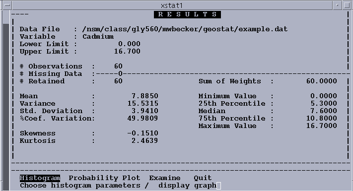
The option sequence below is the minimum required to compute univariate statistics and display a histogram and a probability plot for the variable Cadmium. Note that a default file name (Example.dat) has been carried forward from the previous program. When you finish examining the histogram, you do not go directly back to the main menu; an intermediate menu lets you select alternate options for replotting the histogram.
To simplify explanations in the future, an abbreviated notation for sequence of events will be used. A general formula exists for each option: initiate the option; then take one or more actions, each of which may result in a screen field taking a particular value. The sequence to be followed for univariate statistics is:
COMMAND ACTION FIELD VALUE
----------------------------------------------------
DATA Accept Data File Example.dat
VARIABLE Select variable Cadmium
Accept weight None
Accept log option Off
EXECUTE
HISTOGRAM
QUIT
PROB.PLOT
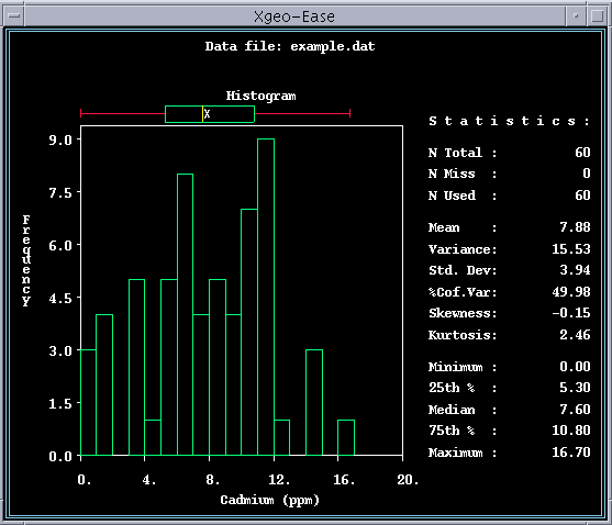
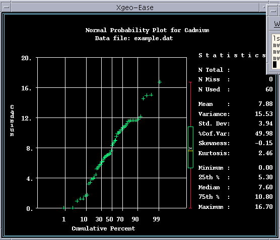
The univariate statistics, histogram, and probability plots are generated. Figure 4-4 displays the univariate statistics for cadmium. Figures 4-5 and 4-6 display the histogram and probability plot for cadmium. From the histogram and the statistics, it can be seen that this data set is nearly symmetrical about the mean value (the mean is close to the median, and approximately halfway between the minimum and maximum values). There are no suspect outliers. The probability plot shows that the data set approximates a normal distribution (a probability plot is a cumulative frequency plot scaled so that a normal distribution plots as a straight line). Whether a distribution is normal, log-normal, or something else has no particular geostatistical significance, except that it is often more difficult to interpret variograms for highly skewed distributions such as the log-normal, and in such cases it may be useful to also compute variograms on log-transformed data.
The computation, interpretation, and modeling of variograms is the "heart" of a geostatistical study. The variogram model is your interpretation of the spatial correlation structure of the sample data set. It controls the way that kriging weights are assigned to samples during interpolation, and consequently controls the quality of the results.
All interpolation and contouring methods make the assumption that some type of spatial correlation is present, that is, they assume that a measurement at any point represents nearby locations better than locations farther away. Variogram analysis attempts to quantify this relationship: How well can a measurement be expected to represent another location a specific distance (and direction) away? Experimental variograms plot the average difference (actually, one-half the squared difference, or variance) of pairs of measurements against the distances separating the pairs. If you had measurements at all possible sample locations, you could compute the "true variogram" for a site, i.e., the variance of all pairs of measurements which satisfy each combination of distance and direction. In practice, with limited data, you compute the variances for groups of pairs of measurements in class intervals of similar distance and direction. You then plot a graph of the variances versus distance for a particular direction, and fit a model curve to the graph; the model is assumed to be an approximation of the "true variogram".
Continuing with the example, we will use Prevar to create an intermediate file of data pairs, and Vario to compute, plot, and model variograms. No automatic model fitting is provided; we will use Vario to superimpose plots of various model curves on the experimental variogram until we find one that looks right.
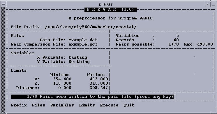
Prevar is a simple program with only a few options to allow you to reduce the number of sample pairs in the output file to the maximum allowed by Vario by setting minimum and maximum limits on X and Y, and by setting a maximum distance for pairs. This is necessary when the number of samples in the data set exceeds 181. For this dataset, however, you will use Prevar to create a file of paired data that will be used by the program Vario.
The option sequence below creates the pair comparison file example.pcf.
OPTION ACTION FIELD VALUE----------------------------------------------------
FILES Accept Data File Example.dat
Accept Pairs File Example.pcf
EXECUTE
QUIT Answer Y
After this sequency, you should receive a message that 1770 pairs of data were written to the file example.pcf.
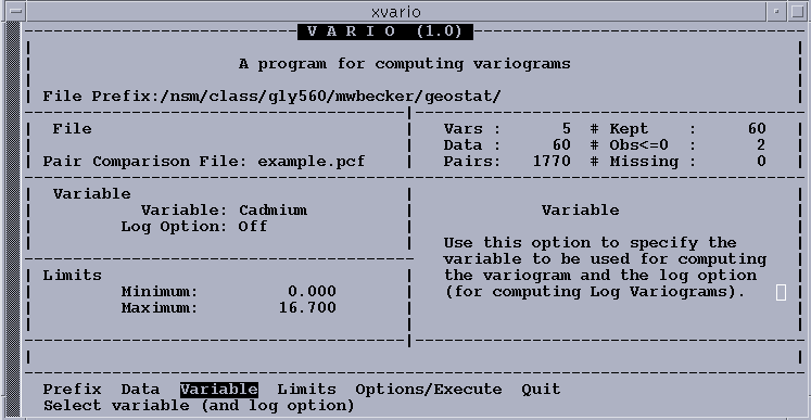
Next, initiate Vario, and the Vario main screen is displayed. The following option sequence reads the pair comparison file into memory, and moves to the next menu:
The Options/Execute menu allows us to specify how we want the experimental variogram to be computed. First, specify the distance class intervals (lags) and directional tolerances for computing the variogram. Remember that to create the variogram we must choose incremental distances in which the sum of all pairs falling in that interval are averaged. These intervals are called "lags" and finding the "right" combination is a trial and error exercise, but a systematic approach can be helpful:
OPTION ACTION FIELD VALUE----------------------------------------------------------
DATA Accept Pairs File Example.pcf
VARIABLE Toggle Variable Cadmium
Accept Log Option Off
OPTIONS/EXECUTE
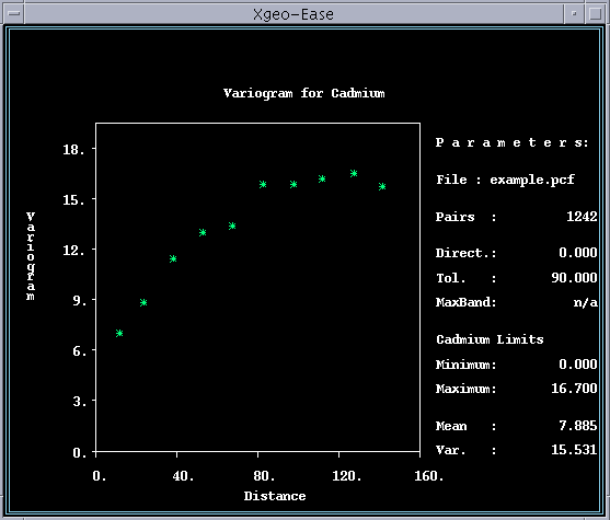
To start, you will use the default direction, which is an "omnidirectional" variogram. The angular tolerance of 90 degrees on either side of any specified direction line allows all pairs to be included regardless of direction. This maximizes the number of pairs in each distance class, which usually gives the "best" or smoothest variogram. From this omnidirectional variogram we can usually get the best estimate of the y-intercept (nugget) and maximum value (sill) parameters for the variogram model, as well as the best idea of what type of model(s) should be fitted.
Next, try several different lag intervals for plotting the experimental variograms. You are trying to obtain the maximum detail at small distances, (i.e., small lags) without being misled by structural artifacts due to the particular class interval used. You will have more confidence in a model if it fits experimental variograms computed at several different lag intervals.
The default lag intervals are computed from a rule-of-thumb which states that variograms are generally not valid beyond one-half the maximum distance between samples. The maximum pair distance is therefore divided by two, and then subdivided into ten equal distance classes. Round these to the more convenient numbers of 150 and 15, and plot the resulting variogram as follows:
OPTION ACTION FIELD VALUE----------------------------------------------------------NEW LAGS Accept Minimum 0Input Maximum 150Input Increment 15EXECUTEPLOT
The resulting variogram shows a well defined structure. Except for the fifth point, which is too low, the shape is typical of a "spherical" model variogram, i.e., an initial linear increase from the Y-intercept curving relatively sharply into a horizontal constant value. The spherical type of variogram is observed frequently in experimental variograms, and is one of the model options available in Geo-EAS. To fit a spherical model to a variogram, you need to estimate the "nugget" or Y-intercept, the "sill" or difference between the nugget and the maximum value, and the "range" or distance at which the model reaches the maximum value. With a little practice, good fits can usually be obtained within two or three tries.
Task: Print a copy of the experimental variogram. Label and give an estimated value for:
Answer this question: What is the maximum distance that you would expect the Cadmium concentrations to be correlated?
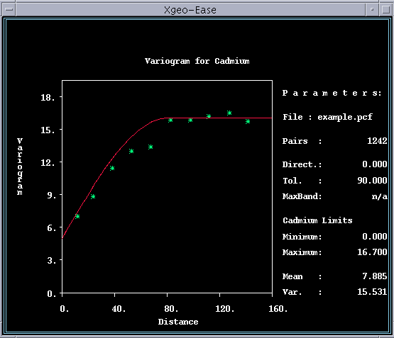
Try an initial model with a nugget of 5, a sill of 11, and a range of 80,
using the following option sequence (Note that after variogram model parameters
have been entered, the
---------------------------------------------------------- MODEL MODEL Input Nugget 5 Toggle Type Spherical Input Sill 11 Input Range 80 PLOT This resulting model fits reasonably
well at the nugget and sill, but the initial slope is too steep, indicating
that the range is too low. It appears that the curve would fit well if it were
shifted about 25% to the right, so you should try again with a range of 100:
---------------------------------------------------------- MODEL Accept Nugget 5 Accept Type Spherical Accept Sill 11 Input Range 100 PLOT This is an excellent fit; about as good as you can get with a spherical model.
That low fifth point, however, suggests that an exponential model which has
a more gentle curvature may also provide a good fit. (If you are unfamiliar
with the four types of models available in VARIO, repeat the option sequence
above three more times, changing the model type each time.) A bit of trial and
error leads to an exponential model with a nugget of 4.5, sill of 13.5, and
---------------------------------------------------------- MODEL Input Nugget 4.5 Toggle Type Exponential Input Sill 13.5 Input Range 160 PLOT Some obvious questions that come up at this point are: Which one of these models
is best? How do you decide which one to use? What happens if you pick the wrong
one? Unfortunately there aren't any simple answers. The best model is the one
which most closely matches the true variogram for the site, but of course, you
will never know what that is unless you exhaustively sample the site. Although
some form of least squares criteria could be used, in Geo-EAS the selection
must be made subjectively, simply by picking the model that looks like the best
fit. Sometimes the error distributions obtained from cross-validation can help
you to decide which. Fortunately, the differences between the spherical and
exponential models above will only cause minor differences in the kriged estimates,
so that either one would be an acceptable choice.
If you look at variograms computed at different lags, it will become obvious
that the experimental variograms contain quite a bit of noise. The shape of
the experimental variogram changes as the lag spacing changes, and the model
which appears to fit best at one lag spacing may appear to be the worst at another.
Try a lag spacing of ten units.
---------------------------------------------------------- QUIT QUIT NEW LAGS Accept Minimum 0 Accept Maximum 150 Input Increment 10 EXECUTE MODEL PLOT As you can see, the ability to define the "true" variogram structure is limited
by the particular set of data available. The best you can do is to find a model
which fits reasonably well over a range of lag spacings. Both of the two models
proposed earlier are satisfactory. In practice, kriging estimates calculated
with the two variogram models will be almost identical. Kriging standard deviations
however, are more sensitive than the estimates to changes in the variogram model,
as well as to differences between the "real world" and the assumptions underlying
the kriging equations. For this reason, it is generally not wise to interpret
kriging standard deviations as a true measure of the estimation error. For the
remaining discussion of variograms the exponential model will be used.
At this point in the structural analysis, anisotropy is the major remaining
question. Quit out of the Plot window and choose Post Plot from the menu. This
will generate a figure much like the scatter plot that you made earlier. Notice
that the data tend to be aligned along certain directions. Now you want to see
if directional variograms confirm this effect. Like lag spacings, directions
and angular tolerances require a trade-off between resolution and precision.
If you plot four directional variograms at angles of 0, 45, 90, and 135 degrees,
with a tolerance of 22.5 degrees, you have effectively divided the pairs in
our omnidirectional variogram into four subsets. This causes an increase in
noise comparable to reducing the lag spacing by a factor of four. It is therefore
advisable to use a larger lag interval for computing directional variograms.
You should use a lag spacing of 25 to compute the four directional variograms
listed above, superimposing the omnidirectional exponential model on the plot.
Run the option sequence below four times, changing only the direction angle.
Save each result as a separate postscript file, and print the results.
OPTION ACTION FIELD VALUE ---------------------------------------------------------- QUIT QUIT DIRECTION Input Direction 0 Input Tolerance 22.5 Accept Bandwidth MAX EXECUTE MODEL PLOT SAVE AS POSTSCRIPT FILE Task: Print all four of the directional variogram plot,
and compare them.
The program Krige assumes that the directional variogram model ranges form
an elliptical pattern. It is therefore only necessary to fit models to the major
and minor axis directions to define the entire 2-D structure. One could make
a case for the range of the major axis (0 degrees) of the exponential model
being anywhere between 250 and 400 units, and the minor axis (90 degrees) being
between 60 and 120 units. We will settle on a model with major and minor axes
of 300 and 100 units, respectively, and move on to kriging.
The program Krige produces a regular grid of interpolated point or block estimates
using either "Ordinary" or "Simple" kriging. The default option, ordinary block
kriging, is recommended for most applications. Point kriging usually provides
estimates very similar to those from block kriging, but if a point being estimated
happens to coincide with a sampled location, the estimate is set equal to the
sample value. This is not appropriate for contour mapping, which implicitly
requires a spatial estimator. Ordinary kriging estimates the point or block
values with a weighted average of the sample values within a local search neighborhood,
or ellipse, centered on the point or block. Simple kriging also assigns a weight
to the population mean, and is in effect making a strong assumption that the
mean value is constant over the site; it also requires that the available data
be adequate to provide a good estimate of the mean.
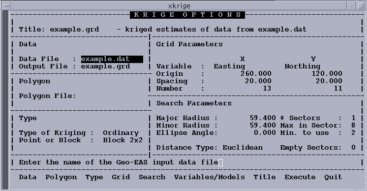
In order to execute Krige we must provide the names of the data file and an
output grid file, and we must select a variable and enter a variogram model.
The program computes a default 10x10 grid, which we will usually want to override
with more convenient "round" numbers. The default search ellipse is a circle
with a radius about one fourth the maximum x or y dimension of the site, which
should be adequate for most cases. The purpose of the search is to reduce computation
time by eliminating from the kriging system of equations those samples which
are unlikely to get "significant weights". The default search strategy is to
treat the search circle as a single "sector", to examine all samples within
it and use at least one, but not more than the closest eight. The number of
samples required for kriging is related to the value of the nugget term in the
variogram compared to the maximum variogram value possible within the search
area. The higher the nugget, the more likely that more distant samples will
get significant weights. A rough rule of thumb is to use eight samples when
the nugget is near zero, increasing to twenty when the nugget is more than 50%
of the maximum value. The more complex sector search options may be useful when
you have unusual patterns or clusters of data. We will accept the default search
for now, and check during kriging to see how well it works. Initiate program
Krige, and the main screen will be displayed.
The Krige main menu allows you to retrieve previously saved kriging parameters,
or to save the parameters you have just used before exiting the program. Because
this is your first attempt with this data set, you must use the Options/Execute
option to go directly to the Options screen and
menu.
Use the following option sequence to specify the file names and grid parameters,
and to proceed to the next menu (Figure 4-22):
---------------------------------------------------------- OPTIONS/EXECUTE DATA Accept Data File Example.dat Accept Grid File Example.grd GRID Accept X variable Easting Accept Y variable Northing Input X origin 260 Input Y origin 120 Input X cell size 20 Input Y cell size 20 Input X # cells 13 Input Y # cells 11 VARIABLES/MODELS The following option sequence leads you to the Variable
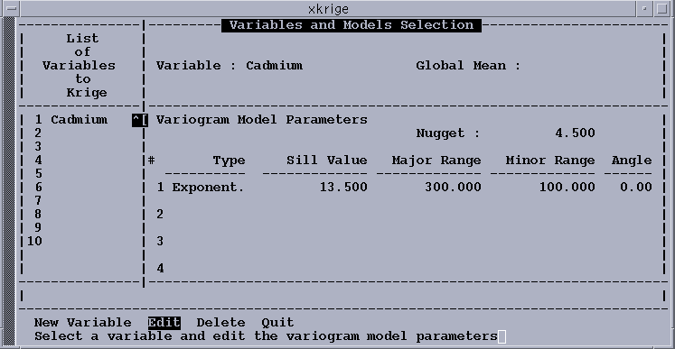
window where you can select Cadmium as the variable to be kriged, enters
the variogram model, executes the kriging routine, and saves the parameter file: ---------------------------------------------------------- NEW VARIABLE Toggle Variable Cadmium Input Nugget 4.5 Toggle Type Exponential Input Sill value 13.5 Input Major range 300 Input Minor range 100 Accept Angle 0 QUIT EXECUTE QUIT SAVE PARAM. Accept Parameter file example.kpf Upon selection of the Execute option, the program first displays a color-coded
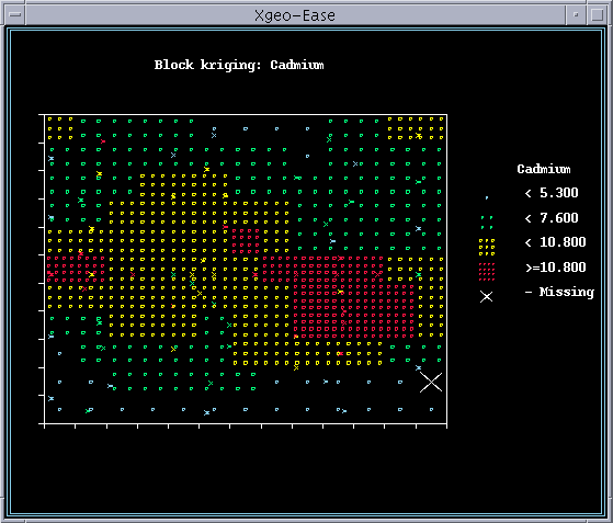
sample location map on the screen, and then overlays this with a color-coded/shaded
grid cell as each kriged estimate is computed. At the bottom of the screen,
a summary line for each estimate is displayed. As you watch this proceed, you
may note that the number of samples being used is only less than the specified
8 for the exterior blocks of the grid, indicating that the default search radii
are adequate to obtain 8 neighbors. You can use the "debug" options during the
kriging computations to help you understand what is actually happening in the
program, and to decide whether you need to change the search options. Activating
"n" provides you with a map showing the search ellipse and the samples selected
for kriging the current block. The goal of the search is to include all of the
samples which are relevant to the estimate, while avoiding spending a lot of
time computing negligible weights for samples that do not matter. The "w" key
lets you look at a list of the selected samples' coordinates, distances from
the block center, and kriging weights. Use w to continue to subsequent displays.
Given that sample weights must sum to 1.0, it seems reasonable to conclude
that samples with weights of less than 0.01 can be neglected without significantly
affecting the kriging results. The goal of your search would therefore be to
consistently find a set of samples such that the lowest two or three weights
would be at or just below 0.01. When you examine the lists of weights for a
number of blocks during this run, you find the lowest weights to generally be
in the range of 0.02 or 0.03. This is not really bad, but it might have been
better to raise the maximum number of samples to 10 or 15 (and increase the
search radii, if necessary).
The kriged results have been written to the file example.grd. Proceed to contour
this grid of kriged values using the your favorite contouring program. These
output files must be reformatted to get them into an ArcView
ASCII Raster Grid, so we will not attempt that today (good topic for a method).
Tasks:
OPTION ACTION FIELD VALUE
OPTION ACTION FIELD VALUE
range of 160.
OPTION ACTION FIELD VALUE
OPTION ACTION FIELD VALUE
Kriging
OPTION ACTION FIELD VALUE
OPTION ACTION FIELD VALUE